

Note: this is actually version 3.1 of The Chart. I made some minor changes from version 3.0, explained here: http://www.adfontesmedia.com/chart-3-1-minor-updates-based-constructive-feedback/
Summary: What’s new in this chart:
- I edited the categories on the vertical axis to more accurately describe the contents of the news sources ranked therein (long discussion below).
- I stuffed as many sources (from both version 1.0 and 2.0, plus some new ones) on here as I could, in response to all the “what about ______ source” questions I got. Now the logos are pretty tiny. If you have a request for a ranking of a particular source, let me know in the comments.
- I changed the subheading under “Hyper-Partisan” from “questionable journalistic value” to “expressly promotes views.” This is because “hyper-partisan” does not always mean that the facts reported in the stories are necessarily “questionable.” Some analysis sources in these columns do good fact-finding in support of their expressly partisan stances. I didn’t want anyone to think those sources were necessarily “bad” just because they hyper-partisan (though they could be “bad” for other reasons.
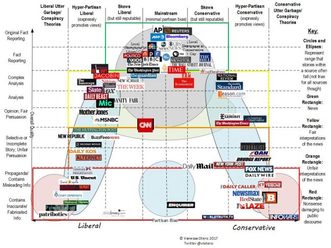
- I added a key that indicates what the circles and ellipses mean. They mean that a source within a particular circle or ellipse can often have stories that fall within that circle/ellipse’s range. This is, of course, not true for all sources
- Green/Yellow/Orange/Red Key. Within each square: Green is news, yellow is fair interpretations of the news, orange is unfair interpretations of the news, and red is nonsense damaging to public discourse.
Just read this one more thing: It’s best to think of the position of a source as a weighted average position of the stories within each source. That is, I rank some sources in a particular spot because most of its stories fall in that spot. However, I weight the ranking downward is if it has a significant number of stories (even if they are a minority) that fall in the orange or red areas. For example, if Daily Kos has 75% of its stories fall under yellow (e.g., “analysis,” and “opinion, fair”), but 25% fall under orange (selective, unfair, hyper-partisan), it is rated overall in the orange. I rank them like this is because, in my view, the orange and red-type content is damaging to the overall media landscape, and if a significant enough number of stories fall in that category, readers should rely on it less. This is a subjective judgment on my part, but I think it is defensible.
OK, you can go now unless you just really love reading about this media analysis stuff. News nerds, proceed for more discussion about ranking the news.
Leave a Reply